

Key Takeaways
The strongest web design examples do more than look attractive: they make a purpose, audience and next step easy to understand. Use the galleries below to collect ideas, then judge each one against your own business needs.
- Study award-winning work for ideas about movement, structure and storytelling.
- Compare clean layouts with more expressive visual directions.
- Check whether inspiration remains usable on mobile and accessible to visitors.
- Borrow principles rather than copying a finished page.
- Treat design as part of a wider website, content and support plan.
1. Awwwards for innovative digital experiences
Awwwards is a useful starting point when you want to see ambitious digital experiences gathered in one place. Its collections make it easier to explore sites by categories such as interaction, typography, scrolling, e-commerce and responsive design. That range is valuable when the brief calls for something more distinctive than a standard brochure site.
The best way to browse is with a question in mind. Look at how a site introduces its story, how movement supports the content and whether unusual navigation still leaves the visitor in control. A striking animation may inspire an idea, but it is only worthwhile if it helps people understand the offer or complete a task.
Award galleries can also reset your expectations about what a polished website feels like. Use them alongside award-winning website inspiration, but separate visual direction from practical decisions such as page length, loading speed, readable type and clear contact routes. The result should suit the organisation, not merely resemble a memorable showcase.
2. SiteInspire for clean, modern layouts
SiteInspire is particularly helpful when you need to refine structure rather than add decoration. Its clean, modern examples reveal how restrained colour, generous spacing and careful typography can give a page confidence. For a local business, this kind of reference is often more useful than a highly theatrical concept because the content remains easy to scan.
Pay close attention to the first screen, the order of information and the visual relationship between headings, images and calls to action. A strong layout lets a visitor form a quick impression without forcing them to work out where to go next. It also offers a sensible starting point for a responsive design that must work across phones, tablets and larger screens.
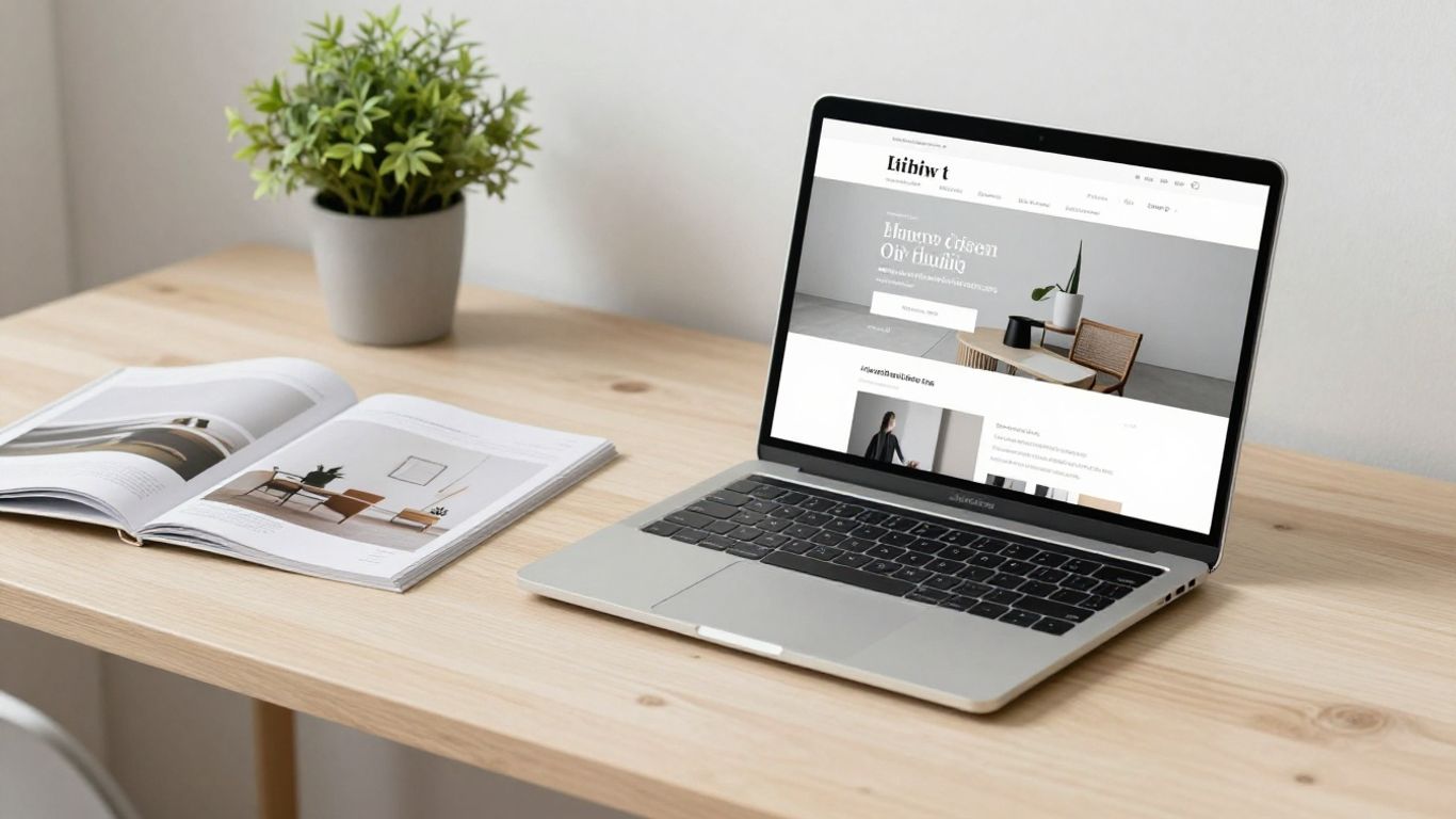
When collecting references, save examples for a reason: a useful service page, a clear navigation pattern or a well-balanced contact section. The broader clean web design examples collection can help you compare those details without treating minimalism as a style that fits every business.
3. Behance for creative web design concepts
Behance works well for exploring the thinking around a website, not just its finished interface. Designers often share moodboards, wireframes, art direction, type choices and several stages of a project. That makes it a good place to understand how a visual idea develops before it becomes a working page.
Concept work is especially useful early in a project, when you are deciding how a brand should feel. You might compare editorial layouts, bold type, illustration-led pages or image-heavy storytelling. The key is to identify the design decision behind the picture: perhaps a strong grid creates order, or a limited palette helps an important message stand out.
There is a practical caution here. A beautiful mock-up may not show navigation states, form behaviour, accessibility details or the compromises needed for real content. Use Behance to shape direction, then test the idea against actual copy, real photographs and the creative web design ideas that support a clear brand story.
4. Dribbble for interface and interaction ideas
Dribbble is useful for small interface decisions that can be hard to imagine from a whole-page screenshot. Browse it for button treatments, menu concepts, card layouts, hover states, icons and mobile patterns. These fragments can prompt useful discussions between a business owner and a designer.
The danger is collecting isolated details without considering the journey around them. A clever hover effect does not improve a page if it hides information from keyboard users or disappears on a touchscreen. Treat each interaction as part of a sequence: what does the visitor know before the action, what happens after it and what should they do next?
A good reference board therefore includes both moments and transitions. Compare a decorative interaction with a simple content reveal, then ask which one makes the service easier to understand. The responsive web design examples are a helpful reminder that flexible layouts, readable text and usable tap targets matter as much as visual polish.
5. CSS Design Awards for technical excellence
CSS Design Awards is a strong source of inspiration for designers interested in the craft behind a polished website. Its recognised work can encourage closer attention to composition, animation, transitions and the relationship between code and visual design. It is best approached as a place to study techniques, not as a standard every small business site must imitate.
Technical detail should serve a visitor. Smooth transitions can make a change of state easier to follow, while a well-built layout can keep content coherent at different screen sizes. When an effect adds delay, confusion or unnecessary weight, it needs a clear reason to stay.
A simple review framework keeps experimentation grounded. Consider the design alongside website design principles, particularly clarity and usability, and test the page on ordinary devices rather than only on a powerful desktop. Useful restraint matters when the site has a commercial job to do.
6. One Page Love for focused single-page websites
One Page Love is a natural place to study single-page websites and focused landing pages. These examples show how a limited page structure can create a clear rhythm: introduce the offer, explain the value, build confidence and provide a next step. That approach can work well for a service, event, product launch or small portfolio.
The format is not automatically simple. A single page still needs meaningful headings, sensible navigation and enough detail for someone who is comparing options. Group related information carefully, use signposts that describe what follows and avoid turning every section into a long block of sales copy.
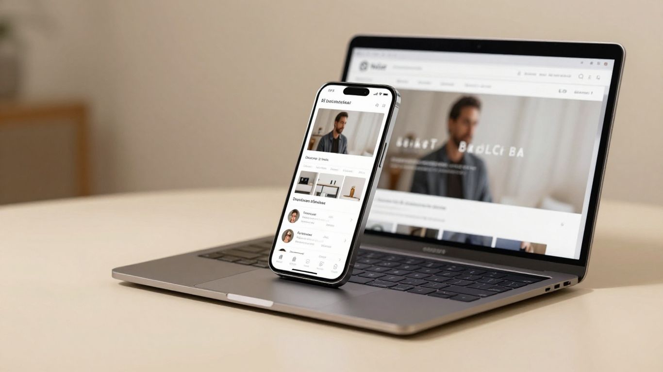
Before choosing this route, list the questions a visitor is likely to have. A page may need to cover the service, process, location, evidence and contact options in a logical order. Browse single-page website ideas for visual prompts, then check whether the finished structure gives each important question a clear answer.
7. Land-book for polished landing page inspiration
Land-book is useful when the immediate goal is to improve a landing page. Its examples bring together different approaches to hero sections, social proof, feature blocks, pricing areas and calls to action. Comparing them side by side can reveal how much clarity comes from hierarchy rather than from elaborate effects.
Start with the promise at the top of the page. It should tell the right visitor what is being offered and why it may be relevant. Further down, supporting sections should answer likely objections instead of repeating the same claim in different colours and type sizes.
A practical landing page also respects the visitor’s attention. Keep forms proportionate to the value of the enquiry, make links descriptive and give mobile users enough room to tap accurately. The polished landing page examples offer a useful comparison point, but the final page should reflect the evidence and language of the business behind it.
8. Godly for bold visual direction
Godly is a good source when you want to explore stronger visual direction. Its kind of inspiration can lead you towards unusual colour combinations, expressive typography, oversized imagery and more confident composition. That can be valuable for creative organisations or businesses with a distinctive point of view.
Bold design works best when there is something clear underneath it. Choose one or two visual ideas to carry through the page instead of making every section compete for attention. Strong contrast, consistent spacing and plain language can keep an expressive design approachable.
You can also use bold references to challenge safe assumptions. Ask whether a warmer palette, a more direct headline or a less conventional image would better fit the audience. The 2026 design trends provide wider context, though trends should be filtered through accessibility, brand fit and the practical content available to you.
9. Webflow Showcase for practical website examples
Webflow Showcase is helpful for seeing how working websites are assembled and presented in practice. Rather than looking only at a static concept, you can inspect examples of navigation, responsive behaviour, page relationships and content patterns. That makes the collection useful for translating inspiration into a more realistic brief.
Study the parts that could be explained to a project team. Note how the site organises its main pages, how the menu behaves on smaller screens and where important actions appear. If search visibility is part of the brief, this Webflow SEO guide is a useful adjacent reference for thinking about metadata, clean URLs, sitemaps and image optimisation.
The most valuable outcome is a short set of decisions, not a long gallery of saved screenshots. Record what you want to borrow, what must change for your audience and what needs testing. This keeps the design conversation practical and avoids promising a feature simply because it looked impressive elsewhere.
10. Commerce Cream for high-converting ecommerce design
Commerce Cream is a useful reference point for ecommerce design, where visual appeal has to work alongside product discovery and purchase decisions. Look at how examples present products, organise categories, handle photography and create a consistent path towards checkout. The details are more instructive when you consider the customer questions they answer.
Good shop design reduces uncertainty. Visitors need to know what a product is, who it suits, how much it costs and what happens after they buy. Product imagery, useful filters, delivery information and visible support all contribute to that confidence, while unnecessary distractions can interrupt the journey.
Use a comparison table when reviewing ecommerce references, because it separates surface style from practical behaviour:
| Area to review | Useful question | Why it matters |
|---|---|---|
| Product presentation | Can the item be understood quickly? | Clear details support confident browsing. |
| Navigation | Can visitors move between categories easily? | A logical structure reduces friction. |
| Mobile layout | Are images, controls and forms comfortable to use? | Many shoppers browse on smaller screens. |
| Checkout path | Is the next step obvious at each stage? | Clarity helps prevent avoidable drop-off. |
That comparison should shape your brief, not dictate a copy. Start with the customer journey, then choose the visual treatment that makes the journey feel trustworthy and straightforward. For wider creative context, ecommerce design inspiration can sit alongside specialist shop examples without replacing user testing.
A good review session should finish with a small set of actions rather than vague approval. For example, you might capture these four decisions:
- Define the main customer and the question the homepage must answer.
- Choose a type scale and colour approach that supports scanning.
- Select one interaction worth testing on mobile and desktop.
- Write down the evidence needed before a visitor makes contact or buys.
These actions turn the best web design website examples into decisions you can apply. They also leave room for the realities of your content, budget and ongoing maintenance.
Get A Clearer Website Plan
If you want inspiration turned into a dependable WordPress website, plan your website with a local team that can help with design, build, hosting, security and ongoing support. The aim is a site that stays useful after launch, not a concept that is left for you to manage alone.
Conclusion
The best web design website examples are valuable because they give you something specific to examine: a clearer layout, a more useful interaction, a stronger visual idea or a better customer journey. Collect references carefully, test them against real users and keep the final decisions grounded in clarity, accessibility and the work your website needs to do.
Frequently Asked Questions
What makes a website design example worth studying?
A useful example offers a clear lesson about structure, navigation, typography, imagery, interaction or conversion. The lesson should be transferable to your own audience rather than dependent on a completely different business model.
How many website examples should I collect?
A focused set of five to ten examples is usually enough to identify patterns without creating confusion. Save each reference with a short note explaining exactly what you want to learn from it.
Should I copy a website design I like?
No. Borrow principles such as hierarchy, spacing or content flow, then develop an original solution for your brand, audience and available content. Copying can also create practical and legal problems.
What should I check beyond visual appearance?
Review mobile behaviour, loading performance, accessibility, navigation, page headings, forms and the clarity of the next step. A page should remain useful for people who do not experience every visual effect.
Are award-winning websites suitable for small businesses?
They can provide ideas, but not every technique will suit a small business. Select the parts that improve understanding or trust, and leave out features that add cost or maintenance without a clear benefit.
How can I judge whether a homepage is effective?
Ask whether the intended visitor can identify what the business offers, where it operates, why it is credible and what to do next. Test those questions with people who were not involved in writing the page.
What should a web design brief include?
Include the audience, business goals, priority services, required pages, content responsibilities, technical needs, accessibility expectations, budget and plans for updates after launch. This gives the design a practical foundation from the beginning.