

Picking the right words about website design can be tricky. It’s not just about making a site look good, is it? It’s about making it work for you, bringing in customers, and making things easy for people to use. We’ve looked at what some smart people have said about website design, finding a quote on website design that really hits the mark. It’s about getting your online presence sorted without too much fuss.
Key Takeaways
- Steve Krug’s advice often boils down to making things obvious. If users can’t figure out what to do, your website isn’t working well.
- Jakob Nielsen stresses usability. A good website should be easy to use and understand, with clear navigation.
- Don Norman talks about design that makes sense. It should match how people think and act, not force them to learn a new way.
- Paul Rand believed design should be simple and memorable. A strong, clear message is better than a cluttered one.
- Dieter Rams’ principles include being innovative and honest. Good design is long-lasting and doesn’t try to trick people.
1. Steve Krug
When it comes to making websites that people actually want to use, Steve Krug is a name that keeps popping up. His book, "Don’t Make Me Think, Revisited", is pretty much a bible for anyone building for the web. The main idea is simple: if a user has to stop and think about what they’re doing on your site, you’ve probably gone wrong somewhere. It’s all about making things obvious and intuitive.
Krug talks a lot about how people scan web pages, not read them word-for-word. They’re looking for specific bits of information, and if they can’t find it quickly, they’ll leave. This is where good design comes in. It’s not about fancy graphics; it’s about clear layout, obvious navigation, and making sure the most important stuff is easy to spot. The best websites are the ones you don’t even notice because they just work.
Think about it from the user’s perspective. They’ve got a goal – maybe they want to buy something, find a phone number, or read an article. Your website should help them achieve that goal with as little fuss as possible. If you’re a business owner in Horsham, for example, and you want more local customers to find you online, you need a website that’s easy for them to use and understand. That’s why services like Web Design in Horsham are so helpful. They sort out the technical bits, like copy, images, hosting, and local SEO, so you can focus on running your business and getting more local enquiries without getting bogged down in the tech.
Krug’s advice boils down to a few key points:
- Make things obvious. Users shouldn’t have to guess what an element does.
- Provide clear feedback. Let users know what’s happening, especially after they take an action.
- Use familiar conventions. Don’t reinvent the wheel for common website patterns.
The goal is to remove any friction between the user and what they came to your site to do. If it feels like work to use your site, people will go elsewhere.
Ultimately, Krug’s philosophy is about respecting the user’s time and intelligence. It’s about creating an experience that feels effortless. For anyone looking to improve their online presence, understanding these basic principles is a great starting point. It’s not about being a design guru; it’s about being thoughtful about the people who will visit your site. You can find more practical advice in Don’t Make Me Think.
2. Jakob Nielsen
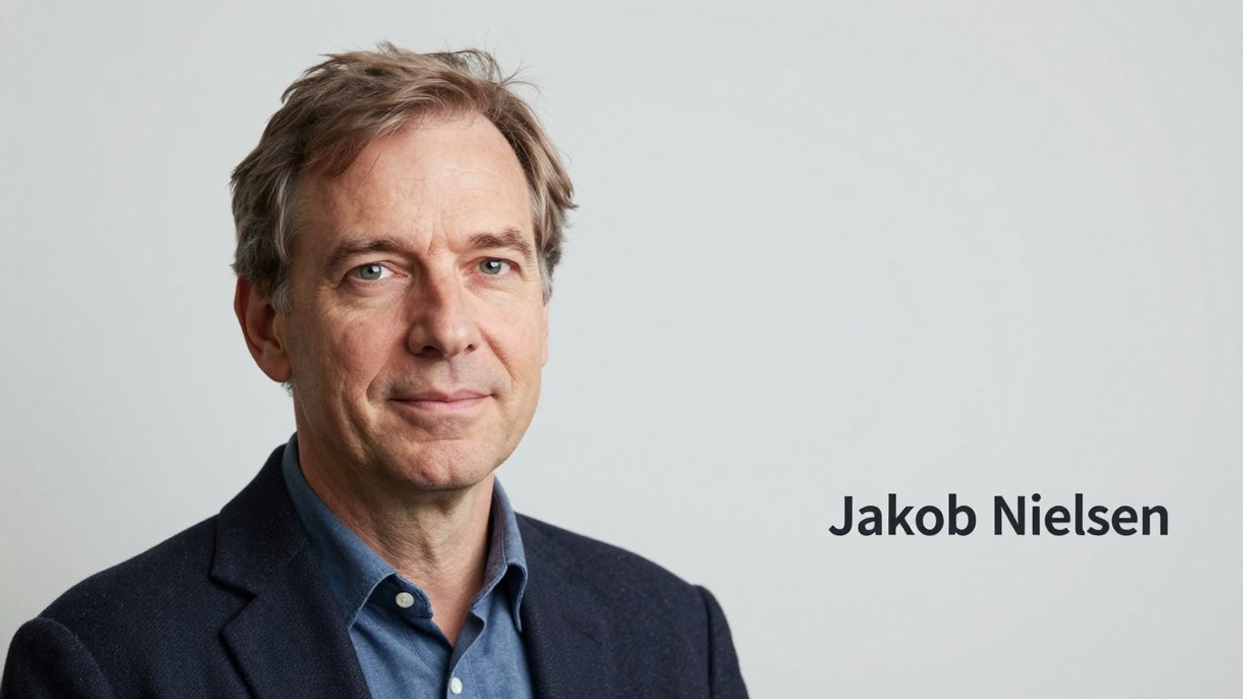
When you think about website usability, Jakob Nielsen’s name probably comes up. He’s been banging on about making things easy for people to use online for ages, way back when websites were still a bit of a novelty. He’s a real usability guru, you know? He even started the whole ‘discount usability’ thing, which basically means you don’t need a massive budget to figure out if your website is actually working for people.
Nielsen’s work really hammered home that design isn’t just about looking pretty; it’s about how well people can actually do things on your site. Think about it – if people can’t find what they’re looking for or get confused, they’ll just leave. It’s that simple. He’s got a ton of research and heuristics that are still super relevant today. For instance, his 10 usability heuristics are like a checklist for making sure your site doesn’t drive people mad.
- Visibility of system status: People should always know what’s going on.
- Match between system and the real world: Use language your users understand.
- User control and freedom: Let people undo mistakes easily.
- Consistency and standards: Stick to conventions so people don’t have to learn new things.
- Error prevention: Design to stop errors before they happen.
- Recognition rather than recall: Make options and actions visible.
- Flexibility and efficiency of use: Cater to both new and experienced users.
- Aesthetic and minimalist design: Get rid of clutter.
- Help users recognise, diagnose, and recover from errors: Clear error messages are key.
- Help and documentation: Provide help when needed.
It’s easy to get bogged down in the technical side of things, especially when you’re running a business. You want more local enquiries, right? That’s where services like Web Design in Horsham come in. They sort out the whole done-for-you website thing – copy, images, hosting, even local SEO – so you can focus on your business. It means you get a professional online presence without having to wrestle with any of the techy bits yourself. It’s a smart way to get more local customers without the headache.
The core idea is that a website should be intuitive. If users have to stop and think too much about how to use it, then the design has failed. It’s about making the path from A to B as smooth as possible.
Back in the day, things like Flash were popular, but they often made websites a nightmare to use. Nielsen was one of the voices pointing out these problems, pushing for designs that actually worked for people. His insights are a big reason why we expect websites to be so easy to use now. He’s been a massive influence on UX and usability for decades.
3. Don Norman
Don Norman, a name that often comes up when you talk about design, really hammered home the idea that good design isn’t just about looking pretty. It’s about how things work, how people use them, and whether they get frustrated in the process. He’s famous for his book, "The Design of Everyday Things," which, honestly, changed how a lot of people thought about making stuff, whether it’s a physical product or, you know, a website.
He talks a lot about ‘affordances’ – basically, what a thing suggests you can do with it. A good door handle, for instance, clearly shows you how to open the door. A bad one? Well, you end up pushing when you should pull, or vice versa. It’s the same with websites. If a button looks like a button, people know to click it. If it’s hidden or looks like plain text, confusion sets in.
Norman’s work really highlights that the user’s experience is the main event. It’s not about showing off fancy graphics; it’s about making things intuitive and easy to use. The best design is often the design you don’t even notice because it just works.
For businesses, especially those in places like Horsham, this is super important. You want your website to be a tool that brings in customers, not a puzzle they have to solve. That’s where getting help makes sense. Think about Web Design in Horsham. They sort out the whole shebang – the words, the pictures, the hosting, even getting you found by local searches. It means you, as a busy business owner, can get more local customers without getting bogged down in the technical bits. It’s about making your online presence work for you, simply and effectively.
4. Paul Rand
Paul Rand, a name synonymous with graphic design, didn’t just talk about logos; he understood their place in the bigger picture of communication. He saw design as a way to make things work, to make them understandable. For Rand, a logo wasn’t just a pretty picture; it was the ‘silent ambassador of your brand’ [ae22]. Think about that for a second. It means your website, your logo, everything people see online, has to speak for you when you’re not there. It needs to tell people who you are and what you’re about, without you having to say a word.
This idea is super important when you’re running a business, especially if you’re busy and don’t have time to fuss over every little detail. You want your online presence to do the heavy lifting. That’s where services like Web Design in Horsham come in. They sort out low-cost, done-for-you websites. This means they handle the copy, the images, the hosting, and even local SEO. For business owners in Horsham and surrounding areas, this is a game-changer. It means more local enquiries coming your way, without you needing to become a tech wizard. They get that you’ve got a business to run, and fiddling with website code isn’t your priority.
Rand’s philosophy was all about clarity and purpose. He believed good design was about problem-solving. So, when you’re thinking about your website, ask yourself: does it solve a problem for your visitor? Does it make it easy for them to find what they need? Does it clearly communicate what you do?
Good design is serious and thoughtful, not playful and silly. It’s about making things clear and functional.
It’s easy to get caught up in flashy trends, but Rand’s perspective reminds us to focus on what actually matters: making your brand recognisable and your message clear. The goal is to create a visual identity that sticks, much like the powerful logos he designed that are still recognised today [24e3]. Your website should be no different; it’s a core part of your brand’s story.
5. Dieter Rams
Dieter Rams, a name synonymous with thoughtful, functional design, offers a perspective that’s incredibly relevant to how we think about websites today. He famously laid out ten principles for good design, and honestly, they still hold up. Think about it: good design is innovative, it makes a product useful, and it’s honest. That’s pretty much what you want from a website, right? It needs to work well, look good, and not try to trick you into anything.
Rams believed that good design should be long-lasting and unobtrusive. For websites, this means creating something that doesn’t just look trendy for a few months but has a solid structure and user experience that stands the test of time. It’s about making things clear and easy to understand, which is a big deal when you’re trying to get your message across online. His ideas about good design being as little design as possible really hit home when you look at cluttered websites. Less is often more, and that’s something we see echoed in modern web design principles.
His focus on making design understandable is a key takeaway for anyone building a web presence.
For businesses, especially those in places like Horsham, this means their website should be a clear, useful tool. You don’t want a website that’s confusing or difficult to use. You want it to help customers find what they need and understand what you offer. That’s where services like Web Design in Horsham come in handy. They provide low-cost, done-for-you websites with copy, images, hosting, and local SEO. This way, busy business owners can get more local enquiries without getting bogged down in the technical side of things. It’s about making good design accessible, just like Rams would have wanted.
His principles, like making design thorough down to the last detail and environmentally friendly, might seem a bit abstract for web design at first glance. But if you think about the ‘thoroughness’ part, it means paying attention to every little bit of the user journey. And ‘environmentally friendly’? In the digital world, that could mean efficient code that loads quickly, reducing energy use. It’s all about creating something that serves its purpose well, without unnecessary fuss. Applying Dieter Rams’ principles to web design means focusing on usability and clarity above all else.
6. Susan Weinschenk
![Portrait of [Susan Weinschenk] discussing website design.](https://contenu.nyc3.cdn.digitaloceanspaces.com/journalist%2F5a265489-8396-4038-a3c0-d898ecdcf3e8%2Fthumbnail.jpeg)
Susan Weinschenk really gets how people think and behave, which is super important for website design. She talks a lot about making things easy for users, so they don’t even have to think about how to use your site. It should just feel natural, you know? Good design is often unnoticeable because it seamlessly meets user needs, making the design itself invisible. That’s the sweet spot. If people are struggling to find what they need or figure out how to click something, they’ll likely just leave. It’s like trying to read a book with smudged ink – frustrating and you don’t get the story.
Weinschenk’s work often touches on the psychology behind why we do things online. Understanding this can help you build a site that not only looks good but also works well for your visitors. This means thinking about things like how people scan pages, what grabs their attention, and what makes them trust a website. Getting this right from the start can save a lot of hassle later on. In fact, research shows that involving user experience thinking early in the process can cut down on rework by a massive 50% and speed up projects by up to half. That’s a big deal when you’re trying to get a business off the ground.
For local businesses, especially those in places like Horsham, this is where getting help makes sense. You’re busy running your business, not trying to become a web design expert. That’s why services like Web Design in Horsham are so useful. They handle the whole thing – the copy, the images, the hosting, and even the local SEO – so you can get more local enquiries without getting bogged down in the technical stuff. It means you can focus on what you do best, and your website will be working hard for you in the background. It’s about making sure your online presence is effective, without adding more to your plate. Think of it as getting a professional to sort out your online shop window so it attracts the right customers. It’s a smart way to build genuine, lasting professional relationships online too, by making sure your site is the first step in a good customer journey.
7. Jared Spool
Jared Spool, a name many in the web design world will recognise, has a pretty straightforward take on what makes a project succeed or, well, not. He points out that a big reason why things go wrong is simply not talking to the people who will actually use the website. It sounds obvious, doesn’t it? But you’d be surprised how often this basic step gets skipped.
The most common reason for project failure is a lack of real user involvement.
Think about it. If you’re building something, you need to know who you’re building it for. What do they need? What do they find easy to use? What drives them mad? Without that feedback, you’re just guessing, and that’s a risky game to play. It’s like trying to cook a meal for someone without asking them what they like to eat – you might end up with something they can’t stand.
This is where services that handle the technical side for you really shine. For business owners in places like Horsham, who are probably busy running their actual business, the idea of getting bogged down in website details can be overwhelming. That’s why having a service that takes care of everything – the words, the pictures, the hosting, and making sure you show up in local searches – is such a good idea. It means you get more local customers without having to become a web expert overnight. Companies like Web Design Horsham do just that, offering done-for-you websites that are affordable and effective.
It’s not just about making something look pretty, though that’s part of it. It’s about making it work for the people who matter most: your customers. Getting that user input early and often is key to building something that actually helps your business grow. It’s about making things easy for them, which in turn makes things easier for you.
Sometimes, the simplest advice is the most overlooked. Focusing on the end-user, the person who will actually interact with your website, is paramount. Their experience should guide every decision, from the layout to the smallest button.
8. Luke Wroblewski
Luke Wroblewski is a name that pops up a lot when you’re looking into how people actually use websites. He’s big on making things simple and easy for users, which sounds obvious, but you’d be surprised how often that gets missed. His work often circles back to the idea that if something is hard to use, people just won’t use it. It’s that straightforward.
He’s a strong advocate for mobile-first design, which makes sense given how much we all use our phones these days. The thinking is, if you get the design right for the smallest screen first, you’re forced to focus on what’s really important. Everything else can be added on as the screen size grows. It’s a way to cut out the clutter and make sure the core message gets across.
Wroblewski often talks about the importance of getting the basics right before worrying about fancy extras. This means thinking about things like clear navigation and making sure buttons are easy to tap. It’s about the user journey, making sure it’s smooth from start to finish.
For businesses, especially those in places like Horsham, this focus on simplicity and user experience is gold. You don’t need a complicated website that confuses your customers. What you need is something that works, looks good, and helps people get in touch. That’s where services like Web Design in Horsham come in. They provide low‑cost, done‑for‑you websites with copy, images, hosting, and local SEO. This means busy business owners can get more local enquiries without having to get bogged down in the technical side of things themselves. It’s about getting a professional online presence sorted without the headache.
He also touches on how we interact with forms online, which can be a real sticking point for users. Making forms easy to fill out, with clear labels and helpful error messages, can make a big difference to conversion rates. It’s all part of that user-centric approach. If you’re thinking about your own website, it’s worth considering how easy you’re making it for people to take the next step, whether that’s signing up for a newsletter or making a purchase. Getting a clear website quote in 2026 is a good first step.
The goal is always to make the user’s interaction as frictionless as possible. If a user has to think too hard about what to do next, you’ve probably gone wrong somewhere.
9. Vitaly Friedman
Vitaly Friedman is a name that pops up a lot when you’re looking into how to make websites work better for people. He’s really into making sure the content on a site is not just pretty to look at, but also easy to use and understand. Think of it like this: you wouldn’t want a book with a gorgeous cover if the pages inside were a jumbled mess, right? Friedman gets that. He’s a big advocate for clear, user-focused design, and he runs workshops to help people get better at building websites that actually serve their audience. He’s all about the practical side of things, too, focusing on front-end development and user experience.
His approach often boils down to making things simple and effective. It’s easy to get lost in fancy features, but Friedman reminds us that the core job of a website is to communicate clearly and allow users to achieve their goals without a fuss. He’s a big believer in testing and iterating, making small, smart changes rather than massive overhauls.
For businesses, especially those in places like Horsham, this focus on clarity and user experience is gold. You might be busy running your actual business, and the thought of wrestling with website code or SEO can be overwhelming. That’s where services like Web Design in Horsham come in. They provide low-cost, done-for-you websites. This means they handle all the technical bits – the copy, the images, the hosting, and even local SEO – so you don’t have to. It’s about getting more local enquiries without you needing to become a web design expert overnight. They take the complexity out of it, letting you focus on what you do best.
Friedman’s work highlights that good design isn’t just about aesthetics; it’s about functionality and making things easy for the person using the site. He’s a strong voice for making the web a more accessible and user-friendly place for everyone. His passion for creating beautiful content and his dedication to front-end and UX are clear in everything he talks about, making him a go-to figure for anyone serious about web design Vitaly Friedman’s work.
10. Jeffrey Zeldman
Jeffrey Zeldman is a name that pops up a lot when you’re looking into web design. He’s been around for ages, really, and has seen the web grow from a bit of a Wild West to the polished thing it is today. He’s a big believer that good design isn’t just about making things look pretty; it’s about making them work well for everyone. He often talks about the importance of standards and accessibility, which makes a lot of sense when you think about it.
Think about it – if your website is hard to use, or if some people just can’t access it at all, you’re missing out. Zeldman’s work pushes us to build sites that are robust and usable, no matter what device someone is using or if they have any specific needs. It’s about building a solid foundation for your online presence, not just slapping on some flashy graphics.
For businesses, especially those in places like Horsham, this is super important. You want your website to actually bring in customers, right? That’s where services like Web Design in Horsham come in. They sort out the whole shebang – the words, the pictures, the hosting, even the local search engine optimisation – so you don’t have to. It means you can get more local people finding you without getting bogged down in the technical bits yourself. It’s about making your website a tool that works for your business, plain and simple.
Zeldman’s philosophy really boils down to this:
- Build for the long term, not just for today’s trends.
- Make sure your site works for all users.
- Focus on content and usability first.
It’s a sensible approach that helps create websites that are not just attractive but genuinely effective.
Jeffrey Zeldman is a big name in the world of web design. He’s known for his ideas on making websites easy to use and look good. If you’re thinking about building a website or making your current one better, learning from experts like him is a great start. For top-notch web design services that can help your business shine online, check out our website today!
So, What's the Takeaway?
Right then, we’ve looked at a fair bit about making your website work for you. It’s not just about having a pretty page online; it’s about making sure people can actually find you and want to get in touch. Think of it like this: a good website is your digital shop window, and a great one is like having a friendly assistant who’s always ready to welcome new customers. We’ve seen how getting the right words and pictures, making it easy to use, and keeping it ticking over behind the scenes all adds up. It’s about making your business stand out, not just in Horsham or West Sussex, but to everyone searching online. So, don’t just have a website, have one that works hard for your business.
Frequently Asked Questions
What's the most important thing in website design?
Making it super easy for people to use! If visitors can’t find what they need quickly, they’ll likely leave. Think about clear menus and buttons that make sense.
How can I make my website look good and work well?
It’s all about balance. A website needs to be attractive, but also simple and straightforward. Fancy designs shouldn’t get in the way of people finding information or doing what they came to do.
Why is user experience (UX) so vital for websites?
User experience is basically how someone feels when they use your website. A good experience means they find it helpful and pleasant. A bad one is frustrating and confusing, making them want to go elsewhere.
Does a website need to be complicated to be effective?
Not at all! Often, the simplest websites are the most effective. Clear language, logical steps, and a clean look help visitors understand your message and take action.
How do colours and layouts affect website visitors?
Colours can make people feel certain emotions, and the way a page is laid out guides their eyes. Using these thoughtfully can make your website more appealing and easier to navigate.
What's the main goal when designing a website?
The main goal is to help the people who visit it. Whether they’re looking to buy something, find information, or contact you, your website should make that process as smooth as possible.